Solidify Your HTML & CSS Knowledge By Writing Clean, Verbose Code

I know what you're saying to yourself after reading the title of this blog post. It's probably something along the lines of, "What? Stylesheets should be highly optimized and minified to reduce load times, not unnecessarily verbose!"
You're right. In production environments, stylesheets should be as optimized as possible and hosted on a CDN to reduce load times and increase the likelihood that your stylesheets are cached. I'm not talking about production environments, though.
This post is intended for those of you who are still learning CSS. What I am about to delve into more than likely isn't standard practice, but it is what helped me understand HTML organization and CSS properties to the point that I could write clear, concise code.
Know Where You're Going
Good front end design starts with a plan. Whether you're a rock star designer or someone who doesn't know Photoshop from Notepad, you should always have a basic layout to reference while writing your code. Take a few moments to think about the page you're working on and how you want the information within the page conveyed, and how you want your users to flow through the page. Rough sketches are quick and easy to do, just grab a pen and paper and jot it all down. It doesn't have to be perfect, or even pretty. It only needs to serve as a simple reference.
For the purposes of this article, we'll start with a classic layout that I've sketched out in Photoshop. This is considered a wireframe design.
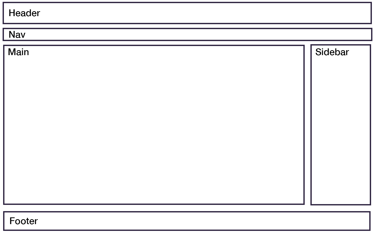
Now that we know where we're going, we can write some bare-minimum HTML.
The HTML
There's absolutely nothing ground-breaking about the HTML that follows. What it should show you is how clearly typed HTML can do wonders for your understanding of a page's layout, and how to easily access these elements within our CSS in a way that doesn't cause you to use an overabundance of classes and/or ID's.
Without further delay, this is the only HTML we'll be writing for the wireframe I put together;
<!DOCTYPE html>
<html>
<head>
<meta charset="utf-8">
<meta name="viewport" content="width=device-width, initial-scale=1">
<title>Classic Layout</title>
<link rel="stylesheet" href="assets/css/classic-layout.css">
</head>
<body>
<header>
<h1>Classic Layout</h1>
</header>
<nav>
<ul>
<li><a href="#">Home</a></li>
<li><a href="#">About</a></li>
<li><a href="#">Contact</a></li>
</ul>
</nav>
<main>
<h2>Main Content</h2>
</main>
<aside>
<h3>Sidebar</h3>
</aside>
<footer>
<p>Copyright © 2020 Classic Layout</p>
<p><a href="#">Privacy Policy</a></p>
</footer>
</body>
</html>
That's it! For the purposes of brevity, I didn't feel the need to go into utilizing divs as containers because we'll be able to get this layout together without them.
Verbose CSS
Here's where things get fun. We have our wireframe and our HTML to match. Now we get to practice our CSS by writing some extremely verbose code that will help us solidify our knowledge of each property and their values. We are assuming absolutely nothing in terms of default values because the purpose of this exercise is to understand and control everything we possibly can on this page.
Pay attention to the layout of the CSS. It mirrors the way the HTML is written in terms of element flow. We start with the body, then on to the header, nav, and so on. This kind of organization may very well help you when debugging certain CSS as you'll know exactly where to go to fix a problem. Well, at least the general area!
body {
  display: block;
  position: relative;
  box-sizing: border-box;
  width: 100%;
  max-width: 100%;
  height: auto;
  margin: 0;
  padding: 0;
  font-family: Arial, Helvetica, sans-serif;
  font-size: 14px;
  overflow-x: hidden;
}

header {
  display: block;
  position: relative;
  box-sizing: border-box;
  width: 100%;
  max-width: 100%;
  height: auto;
  margin: 0 auto;
  padding: 1rem;
  background-color: #333333;
  color: #ffffff;
}

header h1 {
  font-size: 2.15rem;
  font-weight: 700;
  line-height: 2rem;
  margin: 0;
  padding: 0;
}

nav {
  display: block;
  position: relative;
  box-sizing: border-box;
  width: 100%;
  max-width: 100%;
  height: auto;
  margin: 0 auto;
  padding: 0.65rem 1rem;
  background-color: #5f5f5f;
}

nav ul {
  list-style: none;
  margin: 0;
  padding: 0;
}

nav ul li {
  display: inline;
  font-size: 1.05rem;
  font-weight: 400;
  margin: 0;
  padding: 0 2rem 0 0;
}

nav ul li a {
  color: #e0e0e0;
  text-decoration: underline;
}

nav ul li a:hover {
  color: #00acff;
  text-decoration: none;
}

main {
  display: inline-block;
  position: relative;
  box-sizing: border-box;
  width: 100%;
  max-width: 75%;
  height: auto;
  min-height: 500px;
  margin: 0 auto;
  padding: 1rem;
}

main h2 {
  font-size: 1.85rem;
  font-weight: 600;
  line-height: 1.85rem;
  margin: 0 auto 1rem auto;
  padding: 0;
}

aside {
  display: inline-block;
  position: relative;
  box-sizing: border-box;
  width: 100%;
  max-width: 25px;
  height: auto;
  min-height: 500px;
  margin: 0 auto;
  padding: 1rem;
}

aside h3 {
  font-size: 1.6rem;
  font-weight: 600;
  line-height: 1.6rem;
  margin: 0 auto 1rem auto;
}

footer {
  display: block;
  position: relative;
  box-sizing: border-box;
  width: 100%;
  max-width: 100%;
  margin: 0;
  padding: 1rem;
  background-color: #333333;
  text-align: center;
}

footer p {
  font-size: 0.85rem;
  font-weight: 400;
  line-height: 0.85rem;
  padding: 0;
  color: #fff;
}

footer p:first-child {
  margin: 0 auto .5rem auto;
}

footer p:last-child {
  margin: 0 auto;
}

footer a {
  color: #e0e0e0;
  text-decoration: underline;
}

footer a:hover {
  color: #00acff;
  text-decoration: none;
}
I will be the first to admit that this is a ton of repetitive CSS, and is nowhere near production-ready, but I did state at the beginning that production-ready stylesheets wasn't within the scope of this post. This amount of detail, element by element, gives you the big picture of what's going on within your layout. On top of that, there is a fair amount of specificity to the way this CSS is written. Every element placed within the HTML document is reference in its correct document hierarchy, eliminating the need for classes and ID's.
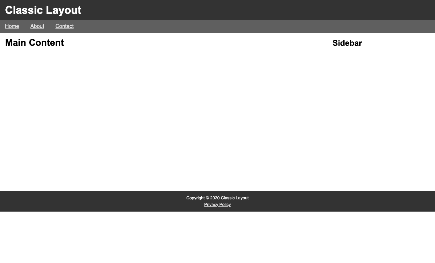
Here's the result of combining our bare-bones HTML and the CSS above:
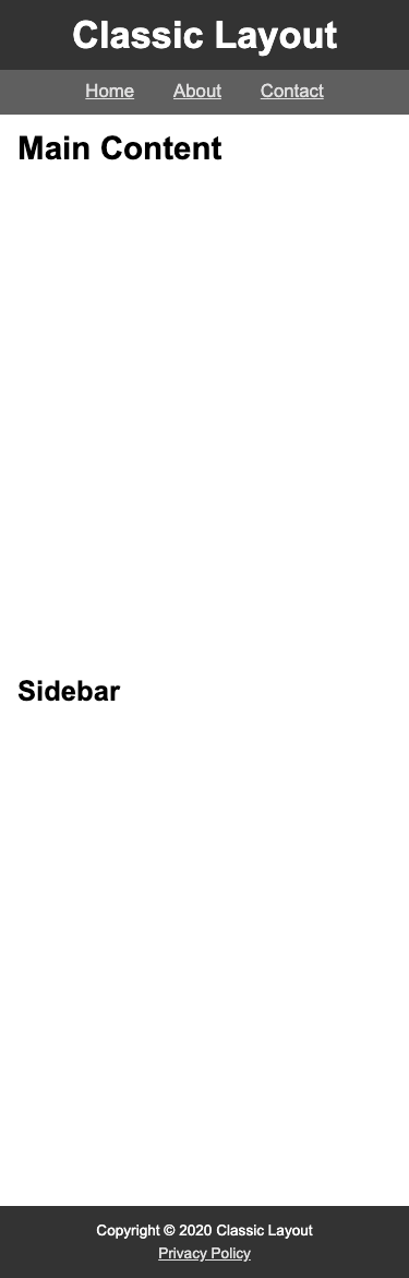
Taking It Further With Media Queries
A two column layout is perfectly fine for desktop or landscape-oriented tablets, but, for mobile users, it'll look a bit cramped. We'll be moving our sidebar beneath the main element for smaller devices. We'll also want to center our "logo" and nav menu items.
@media only screen and (max-width: 720px) {
  header {
    text-align: center;
  }

  nav {
    text-align: center;
  }

  nav ul li {
    padding: 0 1rem;
  }

  main {
    display: block;
    max-width: 100%;
  }

  aside {
    display: block;
    max-width: 100%;
  }
}
Now we have a nice, clean mobile view all thanks to clearly typed CSS within a basic media query:
Conclusion
I want to reiterate the fact that this is not intended for production code. This is a method I came up with during my studies that allowed me to gain more insight into how each element was described within my stylesheets. There is a certain beauty with this method, as well: you can play with CSS attributes and only have it affect a single element due to the specificity of the code!
Try it out during your practice sessions, and do this with every new CSS attribute you come across to gain a better understanding of what you're actually doing to your HTML.
For more content from me, feel free to follow me on Twitter


